

The boss
Funders look you up before they fund you.
- Now it holds up.
- They own it. They edit it. Nobody to pay.
- Real visitor numbers, before and after. Google Analytics connected.
A charity
Funders look you up before they fund you.

Google was reading blank pages.

They asked for bigger text and pages read aloud.
What I did
Every page — about 300 of them, ten years of events and stories — moved across and given a modern design. Tap a marker to see the thinking behind each part.
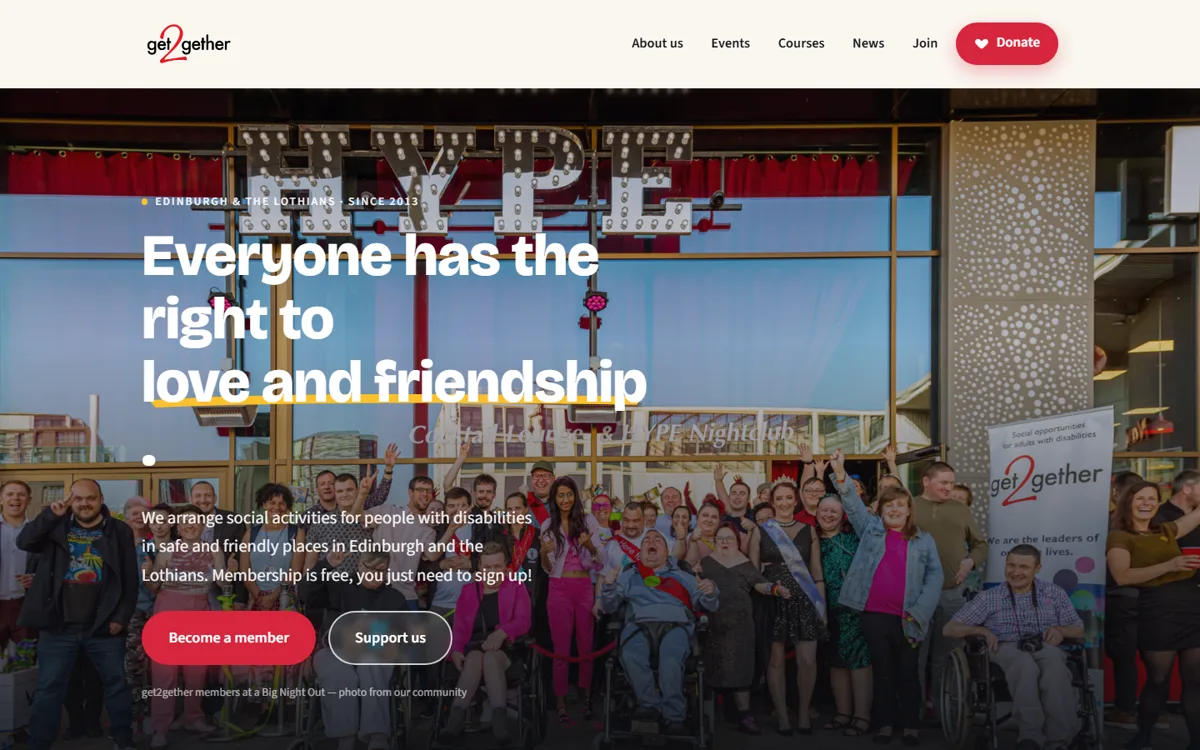
The old one had grown a heading for every project since 2013. This one holds the five things people actually arrive looking for. Everything else is still there, one click further in.
It stays in the corner as you scroll, on every page. Giving shouldn't mean going to find the giving page first.
A first-time visitor knows what this charity is before they scroll. A large share of visits to the old site never got past the first screen.
Join, or support. Those are the only two things a stranger can usefully do when they arrive, so they're the only two on offer.
Real photographs from their own events. A funder can tell the difference in about a second.
Reading the site
Every page has an Accessibility button in the corner. Open it and you can have the page read to you, make the words bigger, or change the background colour — some people find black text on white slides around, and a soft blue or yellow holds still.
It remembers what you chose, so the site is already the way you like it next time you come back.
The old website had none of this. To have it read aloud you'd have had to find and install software of your own first — which is a lot to ask of somebody who just wanted to know when the next Big Night Out is.
Try it on the live siteRunning it themselves
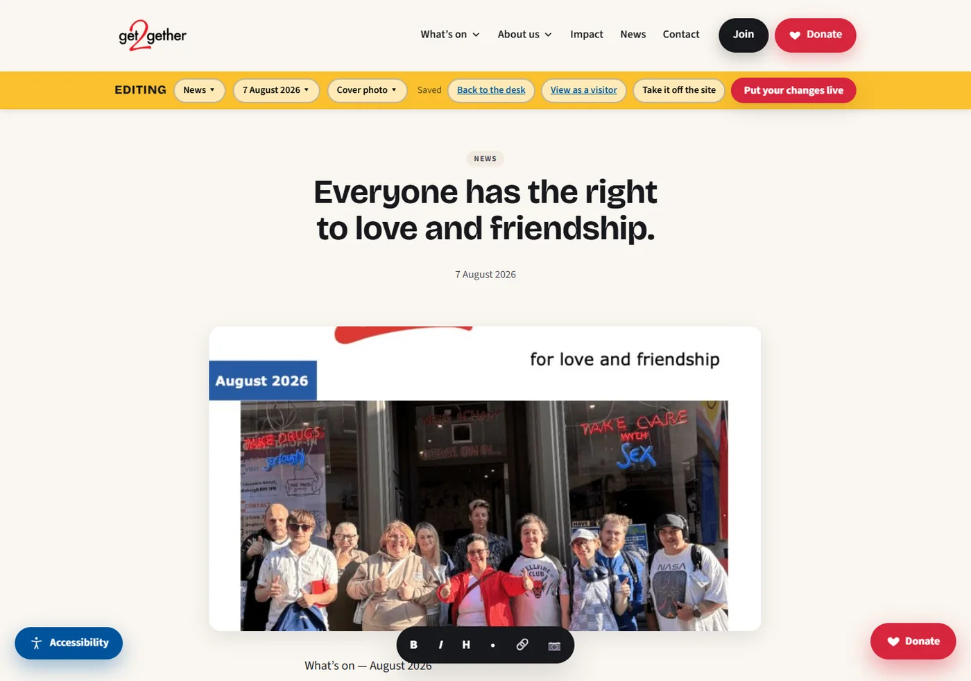
The old site ran on WordPress. Changing anything meant going somewhere else, learning a second system, and hoping the result looked right. So I built them their own.
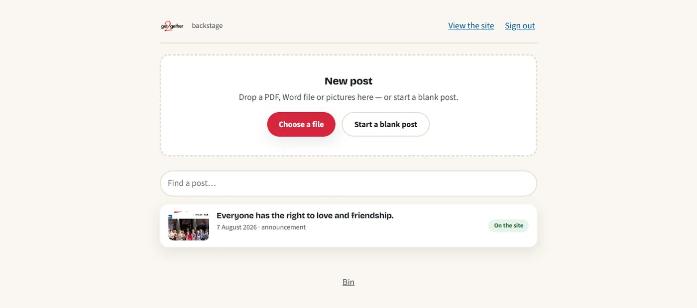
Changing a sentence, before
Changing a sentence, now
There is no second version of the website to imagine. What you're typing into is the page.
I'll look at your website the same way and tell you what I find — whether or not you ever take me up on the free redesign.